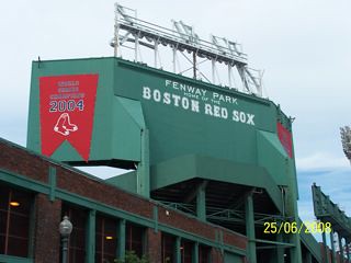
The greatest thing about Fenway Park is its lack of pretense. It wasn't designed in a way that drew attention to itself. It can't afford to be set back in its tiny block of Boston. It doesn't have artfully designed gates and entrances. Nor does it have an very distinctive exterior. It's red brick and green painted steel, of course, but that brick isn't a façade. Along the first base grandstand, it is that brick that keeps standing spectators from falling to the sidewalk below. Fenway was built in sections, expanded over time, and has evolved to become the institution it is today. Never during its 96-year history has there been the luxury of extra space.
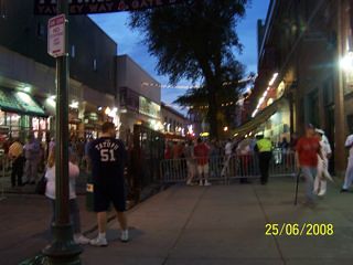
Still, the reputation of Fenway as a tight, cramped space is a bit overblown. Several years ago the City of Boston granted the Red Sox the right to use Yawkey Way as a concourse on gamedays, a la Eutaw Street at Camden Yards. On the first base side the main concourse has a decent amount of room but no place to view the game, unless you're referring to the catwalk-like area behind the grandstand along Van Ness St. Everywhere on the concourse it appears that it's busy and hectic. Yet when you walk into the seating bowl it appears that every seat is filled. What gives? It seems magical.
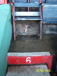
Speaking of magical, there's nothing quite like sitting in one of the wooden grandstand seats towards the rear of the seating bowl. They're comfortable and well-worn, albeit not spacious. The issue with grandstand seats isn't so much the seats themselves as it is the row/riser width. Leg room is severely limited.
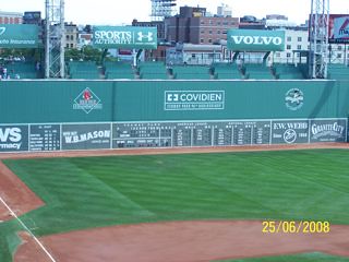
Then there's the Green Monster. It's amazing how much affinity for a place can translate into tangible monetary value. Only in Fenway would outfield seats 37 feet above the playing field be priced $160 apiece. I can't say I'm a big fan. I loved the Monster's lack of clutter prior to the Monster seats and the 2003 All Star Game. I liked the home run net and how sluggers tried to get their blasts over it. That said, little of the Monster's character has changed. Out-of-town scores still have to be changed by hand on the outside of the scoreboard. There's still a resounding clank when a ball bounds off the upper part of the Monster.

The suites and premium/club areas are all above the main seating area, giving a concourses a communal feel. This works from an aesthetic standpoint because many of those patrons, who tend to pay less attention to the game anyway, aren't in high-visibility seating areas where their lack of fan participation would look bad.
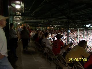
Fenway isn't without faults. No matter how much the purists debate the matter, columns suck. If you happened to be in Section 2 just 20 feet down the row from my seat, this is what your view would look like:
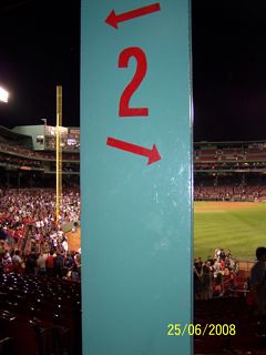
Thankfully, new methods of engineering cantilevers has made columns unnecessary, while allowing for more aggressive overhangs with each new ballpark.
I also noticed the rather ironic framed SI cover while walking through the suite level:

And as hardcore as Red Sox Nation appears to be, they're not immune to their own brand of shameful idiocy. Witness the video I captured:
